How not to be boring
Sep 13, 2024

The world would be more fun if most startups hadn't undergone a personality bypass. But, sadly, most software companies look and feel the same.
Founders have no end of excuses for this. It’s more important to build your MVP and validate it, or you need to find product-market fit and make money so you can survive.
Creating a cool website won't help with either, right?
Wrong. Let me explain why.
"What would stop me from using this thing?"
This was the most important conversation Tim and I had before launching PostHog.
It was going to be free on launch day, but we knew users would still be wary of wasting their time deploying a piece of software produced by a two-person startup.
Being open source helped because people could inspect the code, but we concluded the majority would turn away at the website, the docs, and the readme first.
That's why we set out to create a website and brand that felt both unique and intentional, including a public handbook that explained what we were doing, why, and how.
An obviously templated or generic website signals:
The team behind the product isn't very strong. The product probably won't improve quickly, or become a "must use" tool. Those startup launches that everyone hears about? They've put energy into their appearance.
The product may not exist in a few more weeks. Why should a potential customer invest time in a product if it's obvious the team making it threw its website together in a day, or ripped it from an existing template?
So, as frustrating as it might be to spend extra time and effort on something "superficial" like a website, remember you're providing your product to human beings. Everyone judges books by their covers.
You need to create your brand for someone...
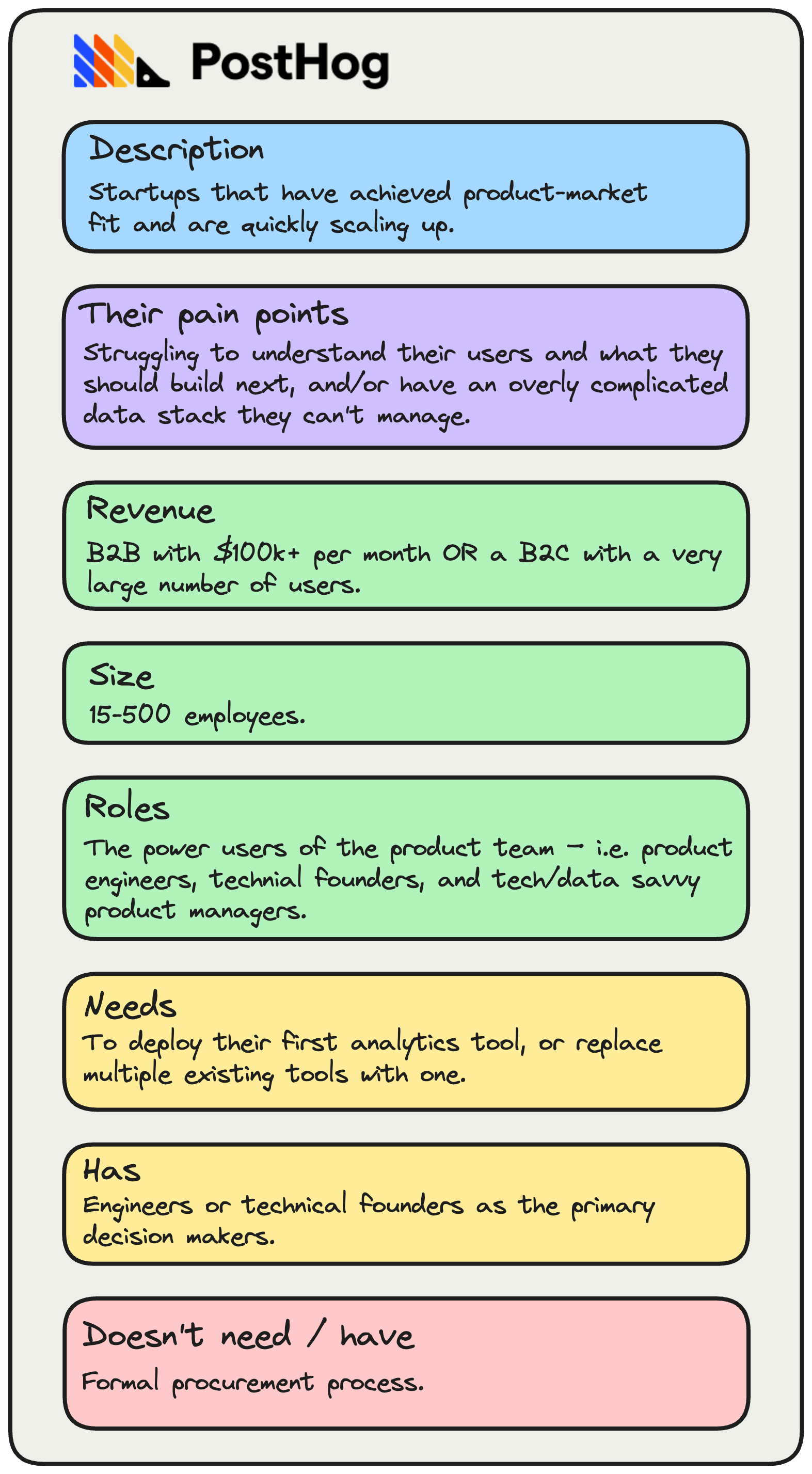
One of the most important things we did was to create an Ideal Customer Profile.
When we launched, we weren't sure whether to focus on engineers, product managers, or both. But we soon realized that we could go all-in on engineers and technical founders, who now make up around 80% of our users.
Our brand and product has become more oriented towards these users as a result.

Here are some ways we got more specific for this audience after we zeroed-in on it:
We added code examples to the homepage, such as how to track an event, or identify a user, and examples of what you can do with our API.
We made buying PostHog easy – the "You'll hate PostHog if" section of our homepage calls out the pet hates of engineers when buying SaaS products.
We chose a transparent, flexible pricing model. It's more complex, but also much better value. We’ve found technical users tolerate a little more complexity if it helps them save money, and only pay for what they use.
We focused on power user features, such as SQL access and a built-in data warehouse, so technical people can get to the underlying data and debug things.
We redesigned our entire UX to have more flexibility, greater information density, and a dark mode. We want PostHog to look like a dev tool, not an analytics product.
...but your brand must be a reflection of you
We’re often impressed at the level of polish others achieve. But, quoting Cory, our lead designer:
"We aren't the best in the world at being polished, but we can be the best in the world at being ourselves".
We sometimes make business decisions based on who we are, and what we want to do – not always what may, for example, generate the most revenue growth.
We chose this path because there was less competition for a self-hosted product. We could build a refined point solution that anyone could self-host, and not worry about competing with cloud-based competitors with over $100m in annual revenue.
But we soon realized we just love shipping new features. After our first hackathon, we wound up with session replay – i.e. a new feature big enough to be its own product. It took off and this resulted in our current multi-product approach.
Eventually, we removed our paid, self-hosted offering entirely, and went all in on multi-product in cloud, and "getting in first" with early-stage companies, not enterprises.
We kept the open-source product, though we stress it's for hobbyists because it's cheaper and easier for companies to have us host it for them.
This strategy works because:
- Being broad lets us compete by being way wider than everyone else.
- Being broad also means we can charge less by cross-selling multiple products.
- It reflects who we are – passionate engineers who love shipping new products.
Had we stuck with the original plan, we’d have lost interest because we weren’t doing what we enjoy. We apply the same mindset to our brand.
If you don’t love it, why will anyone else?
Your brand isn't just your website...
It's how your company is experienced by others. Your company is the product and:
- How much you invest in each function in your company relative to each other.
- What you look for when you hire people, and the process you use to hire them.
- How you decide what to build. Do you ship features early, or do you focus on meeting the needs of your largest customer with every new thing?
- The degree to which you’re led by design, engineering product, sales, or marketing. How many people are in each function, but also your processes for deciding what to work on.
- The frequency and style with which you email your customers, for marketing, product updates or your activation flow.
- The kind of people you hire into customer success or sales.
- The background and experience of those in your marketing team.
- The tone of voice on your website.
- Who is on your board.
- How your pricing works.
- How your social media works.
- How helpful you are to random founders that message you.
- The marketing channels you pick.
- What you talk about in your blog. I'm writing this piece for brand reasons –transparency / equipping developers with knowledge to build successful products. I don’t care if it converts people, I just want to leave an impression. And it's who I am – I'm writing this to pass the time on a long flight.
Everything matters.
You can't 80:20 everything
A lot of design or brand work has an increasing marginal return. This is because a great brand's purpose is that you stand out. You do not stand out by being average!
So, if you're serious, go nuts on your brand. Go weirdly hard.
To give you an example, we built a merch store:

We started with me emailing users for their address and size, ordering merch and having it delivered to my house, and me then posting it internationally to them. Do things that don't scale.
Next, we set up a store on Shopify. I just threw our logo onto an amusingly wide selection of items – PostHog shower curtain, anyone? It was cool to just have merch for sale and a way of giving it.
Then we created custom components and built it into our website directly, so it's perfectly integrated.
Then we booked a photo shoot and took custom photos of our team wearing everything.
Now we're working on limited editions of certain items to create collectible series of t-shirts
Who knows what happens next!
This single thing is easy enough to copy, but it's just one activity among hundreds that builds a brand.
Doesn't this imply doing everything to a really high standard and a ridiculous workload?
Yes. You can be iterative with it, though.
Not everything was amazing on day one, but we keep improving and tweaking everything over time.
So get out there, and be bold
If your brand isn't going to turn off some people that might have bought your product, then it isn't strong enough to stand out.
Engage your best customers with your brand, and put off your worst ones.

Subscribe to our newsletter
Product for Engineers
Practical tips on becoming a better engineer and building successful products. Read by 25k founders and engineers.
We'll share your email with Substack

